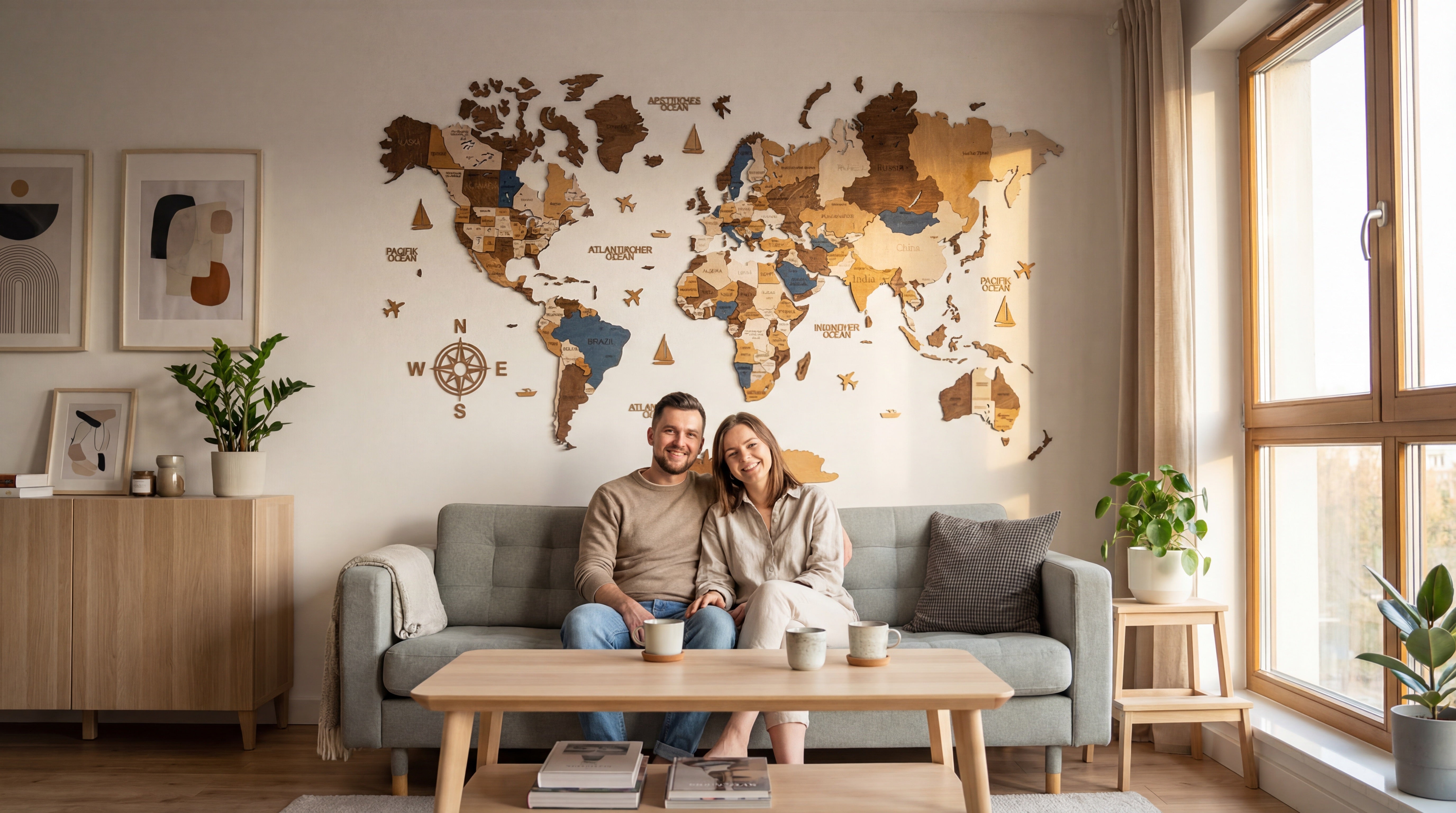
A north-facing wall in a Copenhagen apartment, late afternoon in February. Sideways light from one tall window lands on three metres of pale plaster behind a long grey sofa. For four years the wall held a 50 by 70 print, hung off-centre the weekend the couple moved in. It looked correct in the listing photos and wrong every evening after. The print came down in November. The wall stayed empty for six weeks. The room felt heavier with the print, lighter with nothing, and the question was the same either way: what should that wall be carrying.
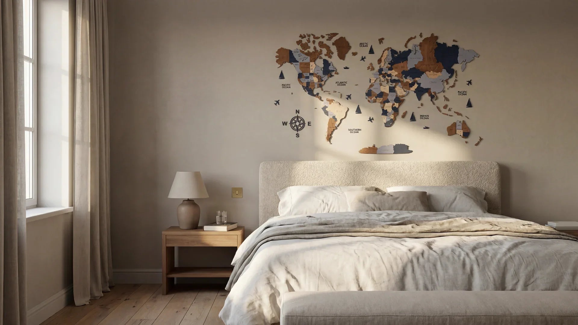
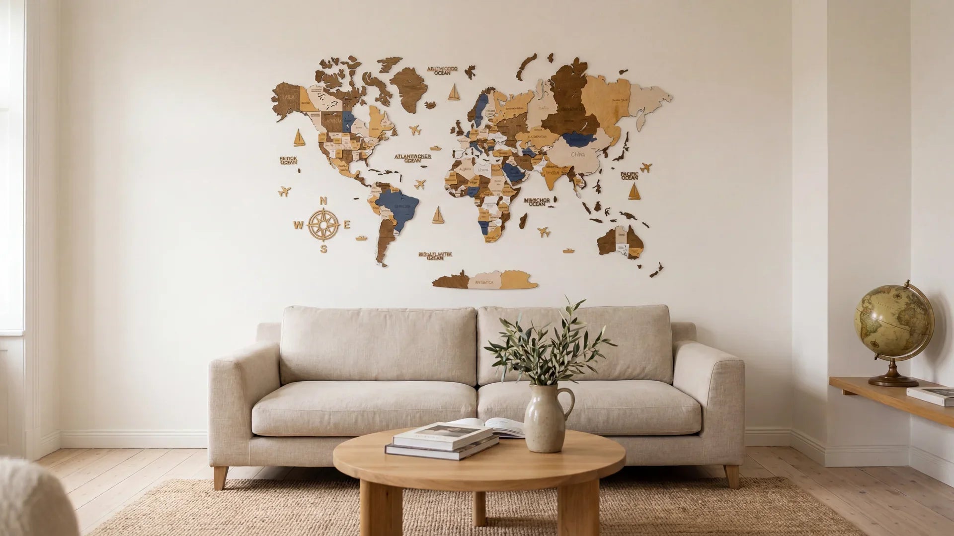
The best living room wall decor ideas work when one piece carries the wall and the rest stays out of its way. Across nine approaches tested in real European rooms the same proportions return: a focal object covering roughly two thirds of the sofa width, hung with its centre 145 to 155 cm from the floor. The strongest version is one anchor object, often a wooden world map, with two warm sconces.
Anna Lindberg, Interior Editor. WOW WOOD editorial team, writing on European living-room decor since 2023.
The 9 ideas, in order of how the wall develops
The wall starts with proportion, ends with hanging height, earns the rest in the middle.
1. The 2/3 rule, restated honestly
The 2/3 rule for wall art says the focal piece should cover roughly two thirds of the width of the furniture beneath it. A 210 cm sofa asks for an anchor object near 140 cm; a 250 cm sofa asks for closer to 165. The Copenhagen wall has a 245 cm sofa; the print on it was 70 cm wide. The proportion was the problem, not the print.
Test the rule without a calculator. Run masking tape across the wall at the width you think the piece should be, walk to the far side of the room, and look.
2. The map above the sofa, size L
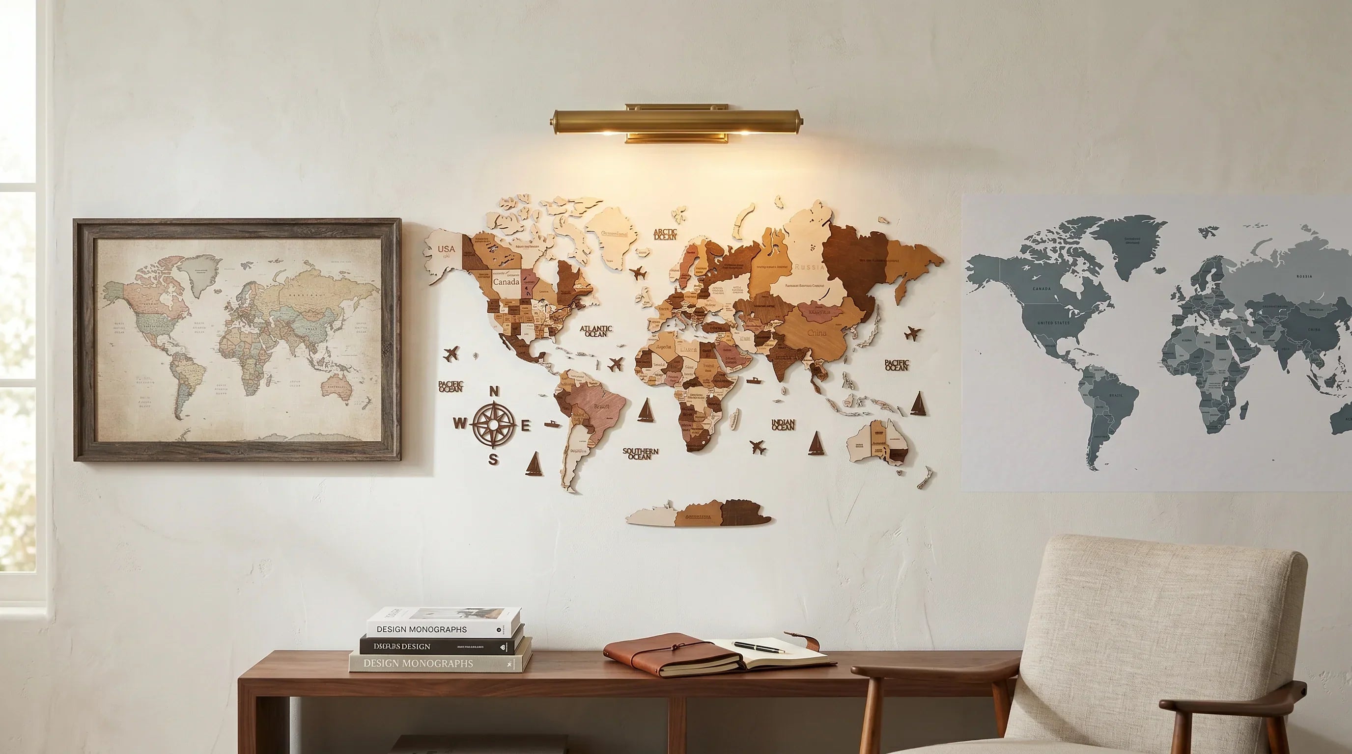
For sofas between 200 and 230 cm, WOW WOOD's Natural Wood wooden world map in size L (160 by 85 cm) lands inside the 2/3 range. The Copenhagen wall took an L in Natural Wood three days before Christmas: 4 mm birch plywood in three layered tiers, fixed with acrylic adhesive dots, no drilling. Against a putty-toned wall the pale birch catches the side-light without raising its voice. On darker walls, charcoal or oxblood or deep clay, the Dark Brown finish holds its weight without becoming a silhouette. Trade-off: the map is the piece. You will not hang anything else above the sofa for a long time.


3. The TV wall almost no one decorates
The wall behind the television is usually given up on. In a 1930s flat near Porto's Bonfim, the screen sat on a low walnut bench, two empty metres of plaster above.
A size L map mounted 28 cm above the screen, centred on the bench rather than on the wall, took the eye off the television. Trade-off: the wall belongs to the map, and the television lives with being second in its own zone.

4. The corner-sofa wall, where the gallery falls apart
Corner sofas defeat gallery walls. Two walls meet behind the seating, four frames in a line read as a pile-up at the corner, and the eye lands on the join, the one spot in the room that should not be holding attention.
The fix is a single piece anchored to the longer wall, set off-centre toward the main seating zone, and stopped short of the corner by at least 35 cm. A size XL map (213 by 113 cm) handles the longer leg of a corner sectional cleanly.
5. Two sconces, warm white, 2700 to 3000 K
Most living-room walls fail before anything is hung on them, because no light reaches them. Two sconces, one each side of the focal piece, set 15 to 25 cm in from its edges, change the wall before any object does. Warm white at 2700 to 3000 K, CRI of 90 or higher: this is professional residential lighting practice, and the maths is unforgiving. Cool white reads the wood as cardboard.
Beata Heuman, of Studio Beata Heuman in London, makes the case throughout Every Room Should Sing (Rizzoli, 2021): a room is decorated by light first and objects second. Hang the sconces. Then decide what they will describe.

6. The slim console as ground line
A console under the focal piece is the floor line of the composition above. Without it, a piece on a tall blank wall floats; with it, the eye climbs in steps. Width 120 to 160 cm, height 70 to 90, depth no more than 30. A small oak shelf with two ceramic vessels and three books reads as composed, not styled.
A console eats 30 cm of depth a narrow room may not have. Use a low bench instead, or skip the floor line if the sofa back sits within 25 cm of the wall.
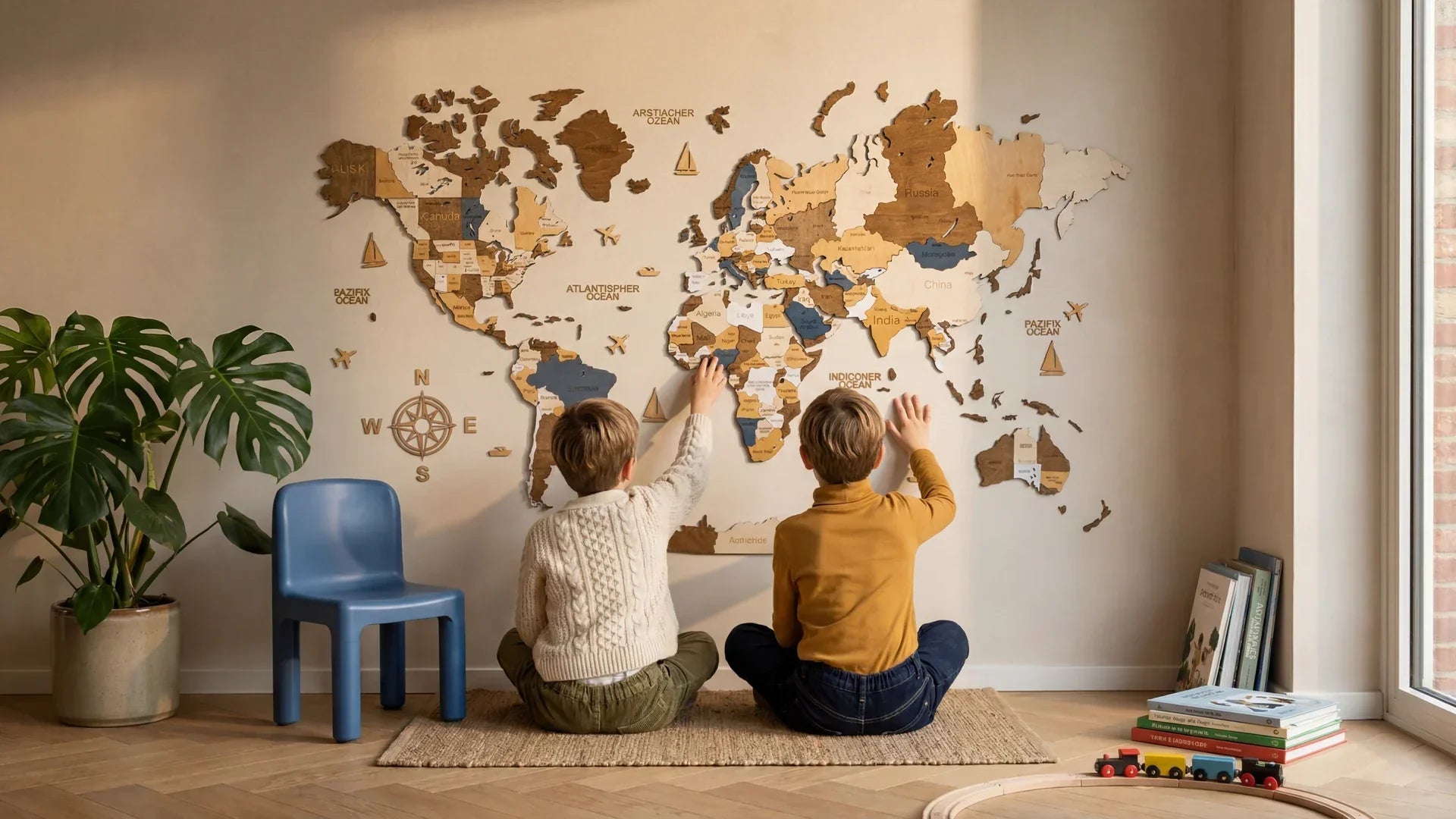
7. The map and the plants, when it works and when it does not
Two tall plants flanking a wall piece, equal height, equal pots, is the most copied living-room layout on Instagram. It is also what makes a room read as styled rather than lived in. Symmetry of that kind kills the centre.
The version that holds uses one plant, off to one side, taller than the symmetrical pair would have been, foliage breaking into the lower third of the focal piece. A 1.9 m olive set 70 cm to the right, leaves crossing the lower edge of a WOW WOOD Natural Wood map, lets the map keep the centre while the plant moves the eye out of it. The Multicolor finish suits plant-heavy rooms; the wood finishes prefer cleaner ones.
8. Above a sectional you don't love
Most readers do not own the sofa they would have chosen. The wall above the sectional is the one place in the room where a decision can still be made.
A size XL map on the longer leg of a sectional, centred to a person sitting on the long side rather than to the geometry of the wall, moves the weight of the room off the seating and onto the wall. After a month the eye stops noticing what the sofa is.
9. The one most people get wrong: hanging height
Almost every wall piece above a sofa hangs too low. The instinct is to leave a hand-width of gap above the sofa back. That puts the centre around 128 to 132 cm off the floor, at the eye level of a person already sitting on the sofa, who is not looking at the wall behind them.
The centre wants 145 to 155 cm off the floor. This is the common gallery hanging convention, sized for the adult standing in the room. The audience is the person who walks in.
What we cut, and why
Two living room wall decor ideas earned a long argument and lost. The shelf-of-objects: three picture ledges layered with framed prints, candles, ceramics, dried branches. A Pinterest staple that requires a level of curation most homes will not keep up with. After three months the ledges hold mail and a phone charger. The oversized clock: a metre-wide brass dial sold as the focal piece. It dates inside three years and dates the room with it.
Mini-FAQ: living-room wall, common questions
What is the 2/3 rule for wall art?
How to hang wall art above a sofa?
What should I put on the wall above my sofa?
How do I decorate a large blank living room wall without drilling?
What should I put on the wall above the TV?
If you are testing the anchor-object idea, the WOW WOOD range of wooden world maps lives at wow-wood.eu. Three finishes, three sizes, 297 pins included. The pins are the point. Place them slowly.


Share: